The grammar of tables in python (pandas) and R (gt)
Introduction
The {ggplot2} 📦1is one of the most widely used packages for data visualization in R. It is based on Grammar of Graphics, Wilkinson (2012), and allows you to generate plots using layers. On the other hand, the Grammar of Tables {gt}📦 2 is used to generate tables with a structure similar to that of {ggplot2}, using layers. Both approaches can be combined with tables that include graphics. In this case, I put together an example with data provided by the open data portal of the Autonomous City of Buenos Aires. The example is replicated with {pandas}📦3.
This post is a short version of the following posts:
The code below shows how to generate the following tables:
![]()


1️⃣ Packages
The required packages 📦are loaded. Both in R and in python.
Code
library(tidyverse)
library(lubridate)
library(circular)
library(gt)
library(gtExtras)
library(gtsummary)
library(reshape)
library(sf)
library(stringr)
library(circular)
library(webshot2)
library(reticulate)
conflicted::conflict_prefer("filter", "dplyr")
conflicted::conflict_prefer("webshot", "webshot2")
conflicted::conflict_prefer("select", "dplyr")
options(scipen=999)
A conda environment is created for this project, with python 3.9.5:
Code
reticulate::conda_create(envname='tables', python_version="3.9.5")The required python packages 📦 are installed via conda-forge with reticulate:
Code
reticulate::conda_install(envname='tables',
                          packages='numpy', channel = 'conda-forge')

reticulate::conda_install(envname='tables',
                          packages='pandas', channel = 'conda-forge')

reticulate::conda_install(envname = 'tables',
                          packages='matplotlib=3.5.3', channel='conda-forge')

reticulate::conda_install(envname = 'tables',
                          packages='plotnine', channel='conda-forge')

reticulate::conda_install(envname = 'tables',
                          packages='jinja2', channel='conda-forge')

reticulate::conda_install(envname = 'tables',
                          packages='seaborn', channel='conda-forge')

reticulate::conda_install(envname = 'tables',
                          packages='geopandas', channel='conda-forge')

reticulate::conda_install(envname = 'tables',
                          packages='ipykernel', channel='conda-forge')
The conda environment is defined for this script:
Code
reticulate::use_condaenv(
  condaenv = 'tables',
  required = TRUE
)
Imports:
Code
import numpy as np
import pandas as pd
import geopandas as gpd
from io import BytesIO
import base64
from IPython.core.display import HTML
from plotnine import *
import seaborn as sns
import matplotlib.pyplot as plt
from mizani.formatters import date_format
from mizani.breaks import date_breaks
from scipy.stats import circmean
import pprint
import warnings
warnings.filterwarnings("ignore")
2️⃣ Data
Data from subway trips in Buenos Aires, Argentina, is used. The period of November 2021 was considered, taking the period of October 2021 to show the percentage variation. The data is loaded with python. Through the {reticulate} package 📦 it will be used with R.
Code
base_url = 'https://cdn.buenosaires.gob.ar/datosabiertos/datasets'
dataset  = 'sbase/subte-viajes-molinetes'

colors = {
  'A':'#18cccc',
  'B':'#eb0909',
  'C':'#233aa8',
  'D':'#02db2e',
  'E':'#c618cc',
  'H':'#ffdd00'
}

def read_data(url, dataset, file):

  path = f'{url}/{dataset}/{file}'

  df_ = (pd.read_csv(path, delimiter=';')

    # Remove useless data
    .query('~FECHA.isna()', engine='python')

    # Columns rename
    .rename(str.lower, axis='columns')
    .rename({
      'linea':'line',
      'desde':'hour',
      'fecha':'date',
      'estacion':'station'
    },axis=1)

    # Transformations
    .assign(
      line = lambda x: [i.replace('Linea','') for i in x['line']],
      date = lambda x: pd.to_datetime(x['date'],format='%d/%m/%Y'),
      color = lambda x: x['line'].replace(colors)
    )
    # Selected columns
    [['line', 'color', 'date', 'hour', 'station', 'pax_total']]
  )

  return(df_)

df = read_data(url=base_url, dataset=dataset, file='molinetes_112021.csv')
df_oct = read_data(url=base_url,dataset=dataset, file='molinetes_102021.csv')
Some stations information is also loaded:
Code
df_stations = (pd.read_csv('data/stations.csv')
  .rename({'linea':'line', 'estacion':'station'}, axis=1)
)
Number of passengers per station:
Code
rename_stations = {
      'Flores': 'San Jose De Flores',
      'Saenz Peña ': 'Saenz Peña',
      'Callao.b': 'Callao',
      'Retiro E': 'Retiro',
      'Independencia.h': 'Independencia',
      'Pueyrredon.d': 'Pueyrredon',
      'General Belgrano':'Belgrano',
      'Rosas': 'Juan Manuel De Rosas',
      'Patricios': 'Parque Patricios',
      'Mariano Moreno': 'Moreno'
}

df_passengers_station = (df
  .groupby(['line','color','station'], as_index=False)
  .agg(pax_total = ('pax_total','sum'))
  .assign(station = lambda x: x['station'].str.title())
  .replace(rename_stations)
  .merge(df_stations, on=['line','station'])
)
Spatial data
Geojson data from the city of Buenos Aires is loaded, in this case, both in R and python:
Code
base_url = 'http://cdn.buenosaires.gob.ar/datosabiertos/datasets/barrios/'
url = paste0(base_url, 'barrios.geojson')

map_caba <- st_read(url, quiet = TRUE) %>%
  mutate(barrio=str_to_title(BARRIO))
Code
map_caba = gpd.read_file(r.url)3️⃣Table
Style and parameters definitions
Some aspects are defined in python:
Code
custom_style = [
  {'selector':"caption",
   'props':[("text-align", "left"),
            ("font-size", "135%"),
            ("font-weight", "bold")]},
  {'selector':'th',
   "props":  'text-align : center; background-color: white; color: black; font-size: 18; border-bottom: 1pt solid lightgrey'},
  {"selector": "",
   "props": [("border", "1px solid lightgrey")]}
]

title ='A summary of the use of the subway in the city of Buenos Aires, Argentina'
subtitle = 'Analysis period: November 2021'

source = "<br>Own elaboration based on data from the Open Data Portal from the city of Buenos Aires</br>"

footer_map = "% of passengers per station in relation to the total number of passengers on that line. For the cuts, the quantiles of the distribution were used. It is observed that Line C presented a very high use in the headwaters, while in the rest of the lines the use was more distributed."

footer_variation = "% Variation in relation to October 2021."

footer_clock = "The color line represents the mean hour, considering the circular distribution of the hour variable."

footer_moments_day = "Percentage per line: Morning = 5 a 11 hs, Afternoon = 12 a 17 hs, Night = 18 a 23 hs"
Functions definition
Images
A function to map a .jpg image with a column of a dataframe:
Code
def map_line_img(i):
    path = f'images/{i.lower()}.jpg'
    return '<img src="'+ path + '" width="25" >'
Line plot
The evolution of passengers per day is included in the tables based on a line plot. Here, some functions are defined to generate these plots.
Code
fig_evol_pax_total <- function(.line, .color){
  py$df %>%
    filter(line == .line) %>%
    group_by(date) %>%
    summarise(n = sum(pax_total)) %>%
    ggplot(aes(x = date, y = n)) +
    geom_line(color = 'grey', size = 2.5) +
    geom_line(color = .color, size = 1.5) +
    scale_y_continuous(
      labels = scales::unit_format(unit = "K", scale = 1e-3)
    ) +
    labs(x = '', y = 'Passengers') +
    theme_minimal() +
    theme(
      text = element_text(size = 30),
      axis.title.y = element_text(color = 'grey'),
      panel.grid = element_blank()
    )
}
Code
def fig_evol_pax_total(i):

    data_line=df.query("line==@i")

    color = data_line.color.max()

    data_line=(data_line
      .groupby('date', as_index=False)
      .pax_total
      .sum()
    )

    p = (ggplot(
          data = data_line,
          mapping = aes(x='date', y='pax_total',group=1)
        ) +
        geom_line(color=color)+
        theme_minimal()+
        labs(x='',y='N')+
        scale_x_datetime(
          labels = date_format("%Y-%m"),
          breaks=date_breaks('7 days')
        )+
        labs(x = '', y = '') +
        theme_void()+
        theme(
          panel_background= element_rect(fill=None),
          plot_background = element_rect(fill=None),
          text=element_text(size=7),
          axis_text_x=element_text(vjust=-0.5)
        )
    )
    return p

def plotnine2html(p,i, width=4, height=2):

    figfile = BytesIO()
    p.save(figfile, format='png', width=width, height=height, units='in')
    figfile.seek(0)
    figdata_png = base64.b64encode(figfile.getvalue()).decode()
    imgstr = f'<img src="data:image/png;base64,{figdata_png}" />'

    return imgstr

def map_plot_evol(i):
    fig = fig_evol_pax_total(i)
    return plotnine2html(fig,i)
Map
Some functions are defined in order to generate the maps in the tables.
Code
fig_map <- function(.df, .line){
   temp <- .df %>%
    filter(line==.line) %>%
    mutate(pax_percent = pax_total / sum(pax_total))

  lbreaks <- round(quantile(temp$pax_percent, c(0,0.25,0.5,0.75,1)),2) %>%
    as.numeric()

  ggplot() +
    geom_sf(data = map_caba,
            color = "black",
            fill = 'white',
            size = 0.1,
            show.legend = FALSE)+
    geom_point(data = temp,
               aes(x = long, y = lat, size=pax_percent), alpha=0.7,
               fill = temp$color %>% unique(), color='black', shape=21)+
    scale_size_continuous(breaks = lbreaks, range=c(1,10),
                          limits=c(min(temp$pax_percent),max(temp$pax_percent)),
                          labels = scales::percent(lbreaks, accuracy=0.1))+
    theme_void()+
    theme(text = element_text(size = 25),
          legend.position = 'right',
          axis.text = element_blank(),
          plot.margin = unit(c(0, 0, 0, 0), "null"))+
    labs(x='',y='',size='')
}
Code
def fig_map(i):

    total_passengers=(df_passengers_station
      .loc[df_passengers_station['line']==i]
      ['pax_total']
      .sum()
    )

    data_line=(df_passengers_station
      .loc[df_passengers_station['line']==i]
      .assign(
        pax_percent = lambda x:
          (x['pax_total']/total_passengers)*100
      )
    )

    color = data_line.color.max()

    lbreaks = round(
      data_line['pax_percent'].quantile([0,0.25,0.5,0.75,1]),2
    )

    p = (ggplot(data=map_caba)+
        geom_map(fill='white', color = "black", size = 0.1)+
        geom_point(data=data_line,
            mapping=aes(x='long',y='lat', size='pax_percent'),
            alpha=0.5, color='black', shape='o', fill=color)+
        scale_size_continuous(
          lbreaks=lbreaks,
          range=[1,10],
          limits = [
            data_line['pax_percent'].min()-1,
            data_line['pax_percent'].max()+1
          ],
          labels=lambda l: [f'{round(i)}%' for i in l])+
        theme_void()+
        theme(legend_position='right')+
        labs(size='%')
    )

    return p

def map_plot_mapa(i):
  fig = fig_map(i=i)
  return plotnine2html(fig, i, width=3, height=3)
Bar plot
In {gt} a function will be used to generate the percentage per moment of the day plot. In python, however, a function needs to be defined:
Code
def fig_percent(i):
    temp = (df
        .query('line==@i')
        .assign(
            group_hour = lambda x: pd.cut(
                x['hour'], bins=3, labels = ['Morning', 'Afternoon', 'Night'])
        )
        .groupby(['line','group_hour'], as_index=False)
        .agg(pax_total = ('pax_total','sum'))
    )
    temp['perc']=round(
      temp['pax_total'] / temp.groupby('line')['pax_total'].transform('sum')*100,2)
    temp['perc_lab'] = [str(i)+'%' for i in temp['perc']]

    p=(ggplot(data=temp,
            mapping=aes(x='line', y='perc', fill='group_hour', label='perc_lab'))+
        geom_col(position= position_stack(reverse=True))+
        geom_text(
            position = position_stack(vjust = .5, reverse=True),
            color='white', size=8)+
        coord_flip()+
        scale_fill_manual(['lightgrey', '#A3B1C9','#4C699E'])+
        theme_void()+
        theme(legend_position='none')
    )
    return p

def map_plot_percent(i):
    fig = fig_percent(i)
    return plotnine2html(fig,i, width=4, height=0.4)
Circular plot
For the circular plot, both functions are defined in R and python.
The mean hour is generated in R, with the {circular} package:
Code
get_hour <- function(.line, .df) {
  temp <- .df %>%
    filter(line == .line) %>%
    select(hour, pax_total)

    hour <- untable(temp, num = temp$pax_total) %>%
      select(-pax_total) %>%
      mutate(circular_hour = circular(hour,
                                      template = "clock24",
                                      units = "hours")) %>%
      summarise(hour = mean(circular_hour)) %>%
      pull(hour)

  as.numeric(hour) %% 24
}
Code
df_mean_hours <- data.frame(
    line=py$df %>% pull(line) %>% unique()
  ) %>%
  mutate(mean_hour = map(line, ~get_hour(.line=.x, .df=py$df))) %>%
  mutate(mean_hour = unlist(mean_hour))
Code
fig_clock_plot <- function(.line, .df, .color = 'black') {

  mean_hour = df_mean_hours %>% filter(line==.line) %>% pull(mean_hour)

  temp <- data.frame(hour = seq(0, 23)) %>%
    left_join(
      .df %>%
        filter(line == .line) %>%
        group_by(hour) %>%
        summarise(pax_total = sum(pax_total)) %>%
        ungroup()
    ) %>%
    mutate(color_hour = ifelse(hour == round(mean_hour), TRUE, FALSE)) %>%
    mutate(pax_total = ifelse(is.na(pax_total), 0, pax_total))

  temp %>%
    ggplot(aes(x = hour, y = pax_total)) +
    geom_col(color = 'white', fill = 'lightgrey') +
    coord_polar(start = 0) +
    geom_vline(xintercept = mean_hour,
               color = .color,
               size = 2) +
    geom_label(
      aes(
        x = hour,
        y = max(pax_total) + quantile(pax_total, 0.3),
        color = color_hour,
        label = hour
      ),
      size = 6,
      label.size = NA,
      show.legend = FALSE
    ) +
    scale_color_manual(values = c('black', .color)) +
    scale_x_continuous(
      "",
      limits = c(0, 24),
      breaks = seq(0, 24),
      labels = seq(0, 24)
    ) +
    scale_y_continuous(labels = scales::unit_format(unit = "K", scale = 1e-3)) +
    labs(y = 'Passengers') +
    theme_minimal() +
    theme(text = element_text(size = 25, color = 'grey'),
          axis.text.x = element_blank())
}
Code
from matplotlib.ticker import FuncFormatter

def thousand_format(x, pos):
    return f'{round(x / 1000)}K'


def gen_clock_plot(df_, mean_hour, x='hour', y='pax_total', color='blue'):

    plt.rc('font', size=8)
    plt.axis('off')

    fig, ax = plt.subplots(figsize=(3,3))
    ax = plt.subplot(111, polar=True)

    cr = df_[y].astype('float').to_numpy()
    hour = df_[x].astype('float').to_numpy()

    N = 24
    bottom = 2
    theta = np.linspace(0.0, 2 * np.pi, N, endpoint=False)
    width = (2*np.pi) / N

    bars = ax.bar(theta, cr,
      width=width,
      bottom=bottom,
      color='lightgrey',
      edgecolor='white')

    ax.vlines(
      x= mean_hour*theta.max()/24,
      ymin=0, ymax=df_['pax_total'].max(),
      color=color)

    ax.set_theta_zero_location("N")
    ax.set_theta_direction(-1)
    ticks = ['0:00', '3:00', '6:00', '9:00', '12:00', '15:00', '18:00', '21:00']
    ax.set_xticklabels(ticks)
    ax.yaxis.set_major_formatter(FuncFormatter(thousand_format))
    ax.grid(False)
    for key, spine in ax.spines.items():
      spine.set_visible(False)

    return fig

def fig_clock_plot(i):
    data_line=df.query("line==@i")
    color = data_line.color.max()

    data_hour = (pd.DataFrame({'hour':range(0,24)})
        .merge(df
            .query('line==@i')
            .groupby('hour', as_index=False)
            .agg(pax_total = ('pax_total','sum')),
            how='left'
        )
        .fillna(0)
    )
    mean_hour = r.df_mean_hours.query("line==@i").mean_hour

    return gen_clock_plot(data_hour, color=color, mean_hour=mean_hour)

def clock2inlinehtml(p,i):
    figfile = BytesIO()
    plt.savefig(figfile, format='png', dpi=100, transparent=True)
    figfile.seek(0)
    figdata_png = base64.b64encode(figfile.getvalue()).decode()
    imgstr = f'<img src="data:image/png;base64,{figdata_png}" />'
    figfile.close()
    return imgstr

def map_plot_clock(i):
    plt.figure(figsize=(2,2))
    fig = fig_clock_plot(i)
    return clock2inlinehtml(fig,i)
Data definition
First, an R and pandas dataframe is generated. This dataframe will later be styled into a well formated table.
Code
cols_selected = c('line','Route','most_used_station','Map','pax_total',
 'variation', 'passengers_type', 'clock_plot','passengers_per_day','color')


r_table_data <- py$df %>% select(line, color) %>% unique() %>%

  arrange(line) %>%

  # Routes
  mutate(
    Route = case_when(
      line == 'A' ~ 'Plaza de Mayo - San Pedrito',
      line == 'B' ~ 'J.M. Rosas - L.N. Alem',
      line == 'C' ~ 'Constitución - Retiro',
      line == 'D' ~ 'Congreso de Tucumán - Catedral',
      line == 'E' ~ 'Retiro - Plaza de los Virreyes',
      line == 'H' ~ 'Hospitales - Facultad de Derecho',
      TRUE ~ ''
    )
  ) %>%

  left_join(
    py$df %>%
      mutate(group_hour = cut(
        hour,
        breaks = 3,
        labels = c('Morning', 'Afternoon', 'Night')
      )) %>%
      group_by(line, group_hour) %>%
      summarise(pax_total = sum(pax_total)) %>%
      group_by(line) %>%
      mutate(pax_percent = round(pax_total / sum(pax_total) * 100)) %>%
      group_by(line) %>%
      summarise(passengers_type = list(pax_percent))
  ) %>%

  left_join(py$df %>%
              group_by(line) %>%
              summarise(pax_total = sum(pax_total))) %>%

  left_join(py$df_oct %>%
              group_by(line) %>%
              summarise(pax_total_oct = sum(pax_total))) %>%

  mutate(variation = (pax_total / pax_total_oct - 1)) %>%

  left_join(
    py$df %>%
      group_by(line, most_used_station = station) %>%
      summarise(pax_total = sum(pax_total)) %>%
      group_by(line) %>%
      slice(which.max(pax_total)) %>% select(-pax_total)
  ) %>%

  # Applying functions
  mutate(

    clock_plot = map2(line, color,
      ~ fig_clock_plot(.line = .x, .df = py$df, .color = .y)
      ),

    passengers_per_day = map2(line, color,
      ~ fig_evol_pax_total(.line=.x, .color=.y)
      ),

    Map = map(line, ~ fig_map(.df = py$df_passengers_station, .line = .x)
      )
  ) %>%

  # Columns selected in order:
  select(all_of(cols_selected))
Code
paths = {
  'A':'Plaza de Mayo - San Pedrito',
  'B':'J.M. Rosas - L.N. Alem',
  'C':'Constitución - Retiro',
  'D':'Congreso de Tucumán - Catedral',
  'E':'Retiro - Plaza de los Virreyes',
  'H':'Hospitales - Facultad de Derecho'
}

py_table_data = (df

    .groupby(['line','color'], as_index=False)

    .agg(
        most_used_station = ('station', pd.Series.mode),
        pax_total = ('pax_total','sum')
    )

    .merge(df_oct
          .groupby('line', as_index=False)
          .agg(pax_total_oct = ('pax_total','sum')),
        on='line', how='left')

    .assign(
       variation = lambda x: (x['pax_total']/x['pax_total_oct']-1),
       pax_total = lambda x: [str(round(i/1000000,2))+'M' for i in x['pax_total']],
       Route = lambda x: x['line'].replace(paths),
       passengers_per_day = lambda x: x['line'],
       Map = lambda x: x['line'],
       clock_plot = lambda x: x['line'],
       passengers_type = lambda x: x['line']
    )

    [r.cols_selected]
)

color_mapping = dict(zip(py_table_data['Route'], py_table_data['color']))
color_mapping_back = dict(zip(py_table_data['Route'], ['#f0f0f0']*6))
Table
Code
gt_table <- r_table_data %>%

  gt() %>%

  tab_header(
    title = md(paste0('**',py$title,'**')),
    subtitle = py$subtitle
  ) %>%

  # Estilo
  tab_style(locations = cells_title(groups = 'title'),
    style = list(
      cell_text(
        font = google_font(name = 'Raleway'),
        size = 'xx-large', weight = 'bold', align = 'left', color  = 'darkblue'
      )
    )) %>%

  tab_style(locations = cells_title(groups = 'subtitle'),
  style = list(
    cell_text(
      font  = google_font(name = 'Raleway'),
      size  = 'medium', align = 'left', color = '#666666'
    )
  )) %>%

  opt_align_table_header('left') %>%
  cols_align('center',
    columns = c(
      'pax_total','variation','most_used_station',
      'clock_plot', 'passengers_per_day')
  ) %>%

  cols_width(
    line ~ px(50),
    Route ~ px(100),
    most_used_station ~ px(80),
    clock_plot ~ px(20),
    pax_total ~ px(80),
    variation ~ px(100)
  ) %>%

  # Grouping columns
  tab_spanner(label = "Use per hour",
              columns = c(passengers_type, clock_plot)) %>%

  tab_spanner(label= "Number of passengers",
              columns = c(pax_total, variation)) %>%

   # Colors
  tab_style(
    style = cell_text(color = "#18cccc"),
    locations = cells_body(columns = c(Route), rows = line == 'A')
  ) %>%
  tab_style(
    style = cell_text(color = "#eb0909"),
    locations = cells_body(columns = c(Route), rows = line == 'B')
  ) %>%
  tab_style(
    style = cell_text(color = "#233aa8"),
    locations = cells_body(columns = c(Route), rows = line == 'C')
  ) %>%
  tab_style(
    style = cell_text(color = "#02db2e"),
    locations = cells_body(columns = c(Route), rows = line == 'D')
  ) %>%
  tab_style(
    style = cell_text(color = "#c618cc"),
    locations = cells_body(columns = c(Route), rows = line == 'E')
  ) %>%
  tab_style(
    style = cell_text(color = "#ffdd00"),
    locations = cells_body(columns = c(Route), rows = line == 'H')
  ) %>%
  tab_style(style     = list(cell_fill(color = "#f0f0f0")),
            locations = cells_body(columns = c('Route'))) %>%

   # Format numeric columns
  fmt_number(pax_total, suffixing = TRUE) %>%
  fmt_percent(variation) %>%

  # Mappings:
  text_transform(
    locations = cells_body(columns = c(line)),
    fn = function(line) {
      lapply(here::here('', paste0('images/', tolower(line), '.jpg')),
             local_image, height = 25)
    }
  ) %>%
  cols_label(line = '') %>%

  gt_plt_bar_stack(
    column = passengers_type,
    position = 'fill',
    labels = c("Morning","Afternoon","Night"),
    palette = c('grey', '#A3B1C9','#4C699E'),
    fmt_fn = scales::label_percent(scale=1),
    width = 60) %>%

  text_transform(
    locations = cells_body(columns = clock_plot),
    fn = function(x) {
      map(r_table_data$clock_plot,
        gt::ggplot_image,
        height = px(250),
        aspect_ratio = 2)
    }
  ) %>%

  text_transform(
    locations = cells_body(columns = passengers_per_day),
    fn = function(x) {
      map(r_table_data$passengers_per_day,
        gt::ggplot_image,
        height = px(200),
        aspect_ratio = 2)
    }
  ) %>%

  text_transform(
    locations = cells_body(columns = Map),
    fn = function(x) {
      map(r_table_data$Map,
        gt::ggplot_image,
        height = px(250),
        aspect_ratio = 2)
    }
  ) %>%

  # Naming variables
  cols_label(
    Map = md('% Passengers per station'),
    clock_plot = md('Passengers per hour'),
    pax_total = md('Total'),
    variation = md('% Variation'),
    passengers_per_day = md('Passengers per day'),
    most_used_station = md('Most used station')
  ) %>%


  tab_footnote(cells_column_labels(columns = variation),
               footnote = py$footer_variation) %>%

  tab_footnote(cells_column_labels(columns = clock_plot),
               footnote = py$footer_clock) %>%

  tab_footnote(cells_column_labels(columns = Map),
               footnote = py$footer_map) %>%

  tab_footnote(cells_column_labels(columns = passengers_type),
               footnote = py$footer_moments_day) %>%

  tab_source_note(
    source_note = html(py$source)
  ) %>%


  tab_style(locations = cells_source_notes(),
            style = list(cell_text(
              font  = google_font(name = 'Raleway'),
              size  = 'medium', align = 'left',  color = '#666666'
            ))) %>%

  tab_style(locations = cells_footnotes(),
            style   = list(cell_text(
              font  = google_font(name = 'Raleway'),
              size  = 'medium', align = 'left',  color = '#666666'
            ))) %>%

  tab_options(
    data_row.padding = px(0),
    table.border.top.style = "hidden",
    table.border.bottom.style = "hidden",
    table_body.border.top.style = "solid",
    column_labels.border.bottom.style = "solid"
  ) %>%

  cols_hide('color')
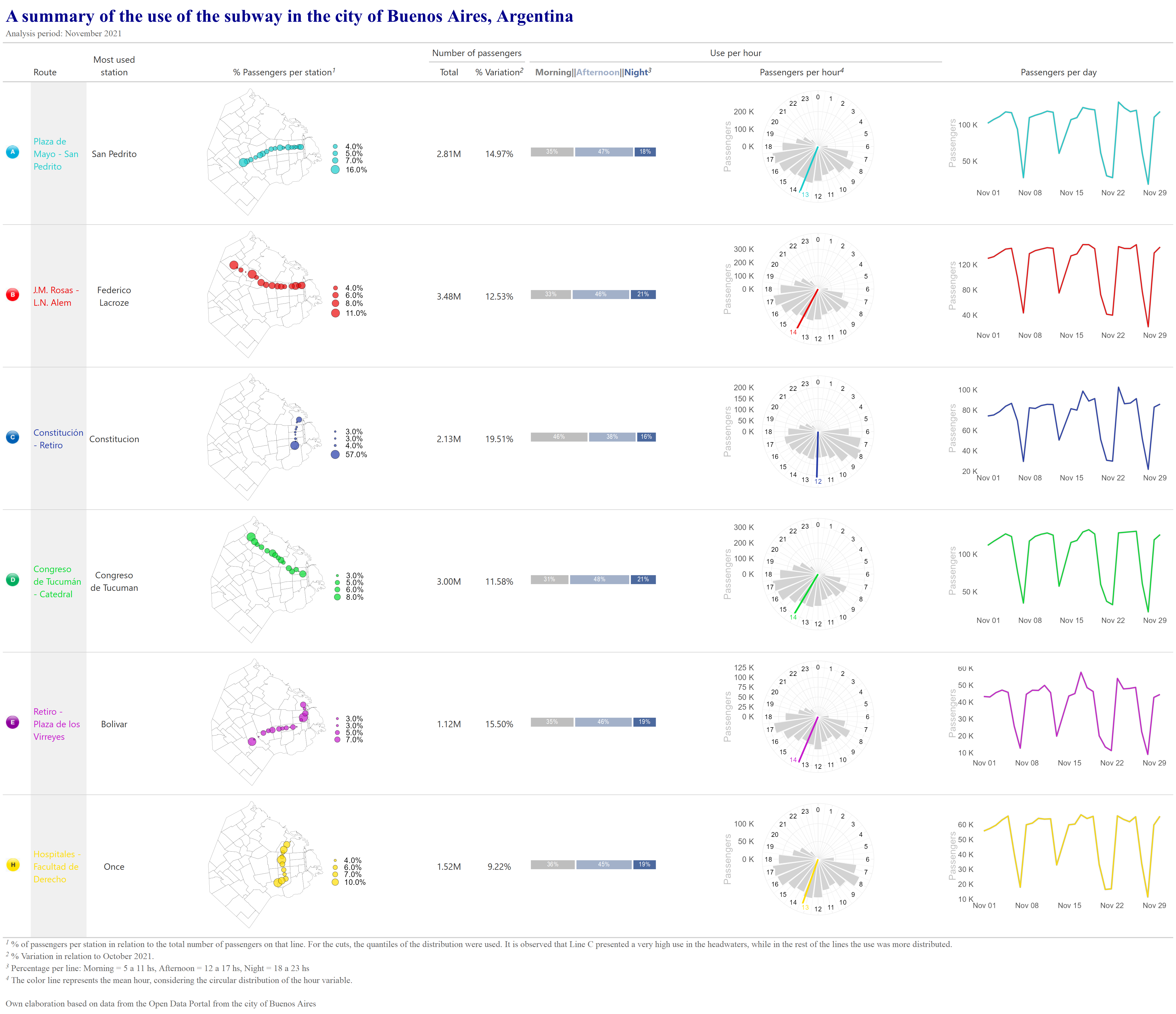
gt_table| A summary of the use of the subway in the city of Buenos Aires, Argentina | ||||||||
|---|---|---|---|---|---|---|---|---|
| Analysis period: November 2021 | ||||||||
| Route | Most used station | % Passengers per station1 | Number of passengers | Use per hour | Passengers per day | |||
| Total | % Variation2 | Morning||Afternoon||Night3 | Passengers per hour4 | |||||
 |
Plaza de Mayo - San Pedrito | San Pedrito |  |
2.81M | 14.97% |  |
 | |
 |
J.M. Rosas - L.N. Alem | Federico Lacroze |  |
3.48M | 12.53% |  |
 | |
 |
Constitución - Retiro | Constitucion |  |
2.13M | 19.51% |  |
 | |
 |
Congreso de Tucumán - Catedral | Congreso de Tucuman |  |
3.00M | 11.58% |  |
 | |
 |
Retiro - Plaza de los Virreyes | Bolivar |  |
1.12M | 15.50% |  |
 | |
 |
Hospitales - Facultad de Derecho | Once |  |
1.52M | 9.22% |  |
 | |
Own elaboration based on data from the Open Data Portal from the city of Buenos Aires |
||||||||
| 1 % of passengers per station in relation to the total number of passengers on that line. For the cuts, the quantiles of the distribution were used. It is observed that Line C presented a very high use in the headwaters, while in the rest of the lines the use was more distributed. | ||||||||
| 2 % Variation in relation to October 2021. | ||||||||
| 3 Percentage per line: Morning = 5 a 11 hs, Afternoon = 12 a 17 hs, Night = 18 a 23 hs | ||||||||
| 4 The color line represents the mean hour, considering the circular distribution of the hour variable. | ||||||||
Code
pd_table = (py_table_data.drop('color',axis=1)

  .style

  .applymap(lambda v: f"color: {color_mapping.get(v, 'black')}")

  .applymap(lambda v: f"background-color: {color_mapping_back.get(v, 'white')}")

  .set_table_styles(custom_style)

  .set_caption(f"""
    <h1><span style="color: darkblue">{title}</span><br></h1>
    <span style="color: black">{subtitle}</span><br><br>
    """
   )

  .hide(axis='index')

  # Mappings:
  .format(
    formatter={
      'line':map_line_img,
      'Map':map_plot_mapa,
      'passengers_per_day': map_plot_evol,
      'passengers_type':map_plot_percent,
      'clock_plot': map_plot_clock,
      'variation': '{:,.2%}'.format
    }
  )

  .set_properties(**{'font-size': '18pt'}, overwrite=False)
  .set_properties(subset=['Route'], **{'width': '10px'}, overwrite=False)
  .set_properties(subset=['line'], **{'width': '5px'}, overwrite=False)

  .to_html()

  .replace('line</th>','')
  .replace('pax_total</th>','Number of<br>passengers')
  .replace('passengers_type</th>',
   """% Passengers per moment (3)<br>
      <span style="color: lightgrey">Morning</span> |
      <span style="color: #A3B1C9">Afternoon</span> |
      <span style="color: #4C699E">Night</span>
   """
  )
  .replace('Map</th>','% Passengers per station (1)')
  .replace('variation</th>','% Variation (2)')
  .replace('passengers_per_day</th>','Passengers per day')
  .replace('clock_plot</th>','Passengers per hour (4)')
  .replace('most_used_station</th>','Most used station')
   + f"""<caption>
            (1) {footer_map}
            <br>(2) {footer_variation}
            <br>(3) {footer_moments_day}
            <br>(4) {footer_clock}
            <br>{source}
         </caption>"""
)

# Displaying the table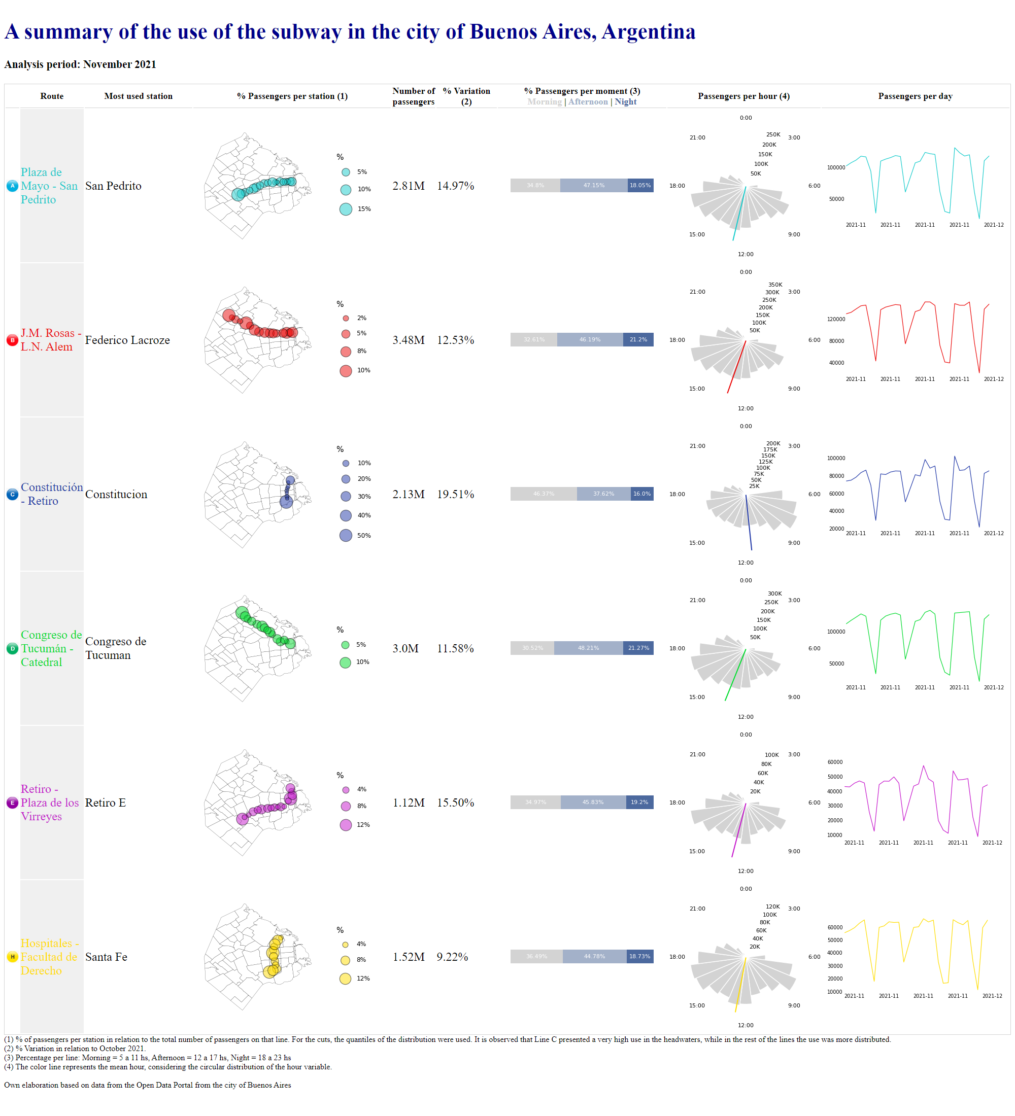
HTML(pd_table)| Route | Most used station | % Passengers per station (1) | Number of passengers | % Variation (2) | % Passengers per moment (3) Morning | Afternoon | Night | Passengers per hour (4) | Passengers per day | |
|---|---|---|---|---|---|---|---|---|
| Plaza de Mayo - San Pedrito | San Pedrito |  |
2.81M | 14.97% |  |
 |
 |
|
| J.M. Rosas - L.N. Alem | Federico Lacroze |  |
3.48M | 12.53% |  |
 |
 |
|
| Constitución - Retiro | Constitucion |  |
2.13M | 19.51% |  |
 |
 |
|
| Congreso de Tucumán - Catedral | Congreso de Tucuman |  |
3.0M | 11.58% |  |
 |
 |
|
| Retiro - Plaza de los Virreyes | Retiro E |  |
1.12M | 15.50% |  |
 |
 |
|
| Hospitales - Facultad de Derecho | Santa Fe |  |
1.52M | 9.22% |  |
 |
 |
(2) % Variation in relation to October 2021.
(3) Percentage per line: Morning = 5 a 11 hs, Afternoon = 12 a 17 hs, Night = 18 a 23 hs
(4) The color line represents the mean hour, considering the circular distribution of the hour variable.
Own elaboration based on data from the Open Data Portal from the city of Buenos Aires
Saving the table
Both tables are saved as a png image.
Code
gt::gtsave(gt_table, 'gt_table.png', vwidth = 2400, vheight = 1000)
Code
# gt::gtsave(data=gt_table, filename='gt_table.html')
# webshot(
#   url='gt_table.html',
#   file="gt_table2.png",
#    vwidth = 2000, vheight = 1500, cliprect = "viewport"
# )
Code
f = open("pd_table.html", "w")
f.write(pd_table)546788Code
f.close()In this case, I’ve decided to use {webshot2}, an R package to convert an html file to png:
Code
webshot2::webshot(
  url='pd_table.html',
  file="pd_table.png",
  vwidth=2000,
  vheight = 2200,
  cliprect = "viewport"
)
Contact ✉
References
Iannone, Richard, Joe Cheng, and Barret Schloerke. 2021. Gt: Easily Create Presentation-Ready Display Tables. https://CRAN.R-project.org/package=gt.
McKinney, Wes et al. 2010. “Data Structures for Statistical Computing in Python.” In Proceedings of the 9th Python in Science Conference, 445:51–56. Austin, TX.
Wickham, Hadley. 2016. Ggplot2: Elegant Graphics for Data Analysis. Springer-Verlag New York. https://ggplot2.tidyverse.org.